I started auditing dental practice websites in Austin because we were building one for a downtown dental group and I wanted to know what the competitive landscape actually looked like. I reviewed 14 practices — general dentistry, cosmetic, orthodontics — ranging from solo practitioners off South Lamar to multi-chair group practices in the Domain and Mueller. The findings were more consistent than I expected.
Most of the sites treated the homepage as a brochure: here are the services we offer, here is our address, here is a stock photo of a woman smiling at the camera. That's a fine brochure. It is not a conversion-focused website. And for a practice that books at $150 to $600 per appointment and runs at 85% capacity, there's real revenue sitting on the table in the form of new patients who visited the site and didn't book.
These are the five patterns we kept finding — and what they actually cost.
Stock photography that patients recognize as stock photography.
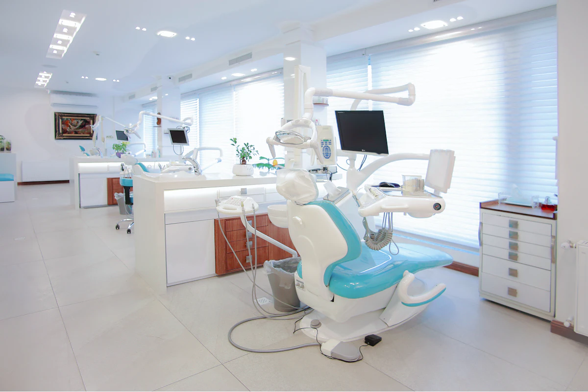
Eleven of the fourteen practices we reviewed used stock photography as their primary imagery — the same library of models with perfect teeth, staged operatory rooms that don't quite match any real office, and "professional" headshots of dentists that look like they were taken by the same photographer in 2017. Patients know what stock photography looks like. It signals: this practice didn't invest enough to show you what it actually looks like.
Healthcare trust is built through specificity. A patient evaluating a dental practice online wants to see the actual reception area, the actual treatment rooms, the actual faces of the dentist and hygienist they'll meet. That specificity signals transparency — which signals trustworthiness. Generic stock photography signals the opposite: a practice that hasn't thought carefully about what a new patient experiences before they walk in the door.
The practices in our sample with authentic photography — real office shots, real team photos, candid treatment room images — had demonstrably stronger above-the-fold impressions. Visitors stayed on the page longer, and the Google Maps reviews for those practices correlated with what the website showed. The photography was doing the work of a pre-consultation.
The fix: A half-day of professional photography — real team headshots, office walkthrough, operatory detail — is the single highest-leverage investment a dental practice can make in their digital presence. It costs roughly the equivalent of one or two new-patient appointments and it works for three to five years.
Booking takes six clicks. Patients abandon after two.
We mapped the new-patient appointment booking flow on all fourteen sites. The average path from homepage to confirmed appointment request was 5.8 clicks. The two practices with the most streamlined booking flows averaged 2.1 clicks. Booking friction doesn't just slow down conversions — it filters out the patients who are mildly interested but haven't made a firm decision yet. That's the majority of new patients.
Six of the fourteen practices required new patients to fill out a form with ten or more fields before they could request an appointment. Name, address, date of birth, insurance provider, insurance ID, reason for visit, preferred appointment time, phone, email, and sometimes a second emergency contact — before they'd even confirmed whether the practice accepted their insurance. Asking that much from a stranger who found you on Google is a confident bet that they'll close the tab instead.
"The booking form isn't a screening tool. It's a conversion step. Ask for the minimum you need to hold the appointment, and get the rest from the patient when they arrive."
Field note from a downtown Austin general dentistry rebuildThe fix: Reduce the booking form to name, phone, email, preferred time, and reason for visit. Get everything else at intake. The form is not the chart — it's the handshake. Every Southern Sites healthcare build ships with an inline booking flow that's two clicks from the homepage.
No upfront insurance check — and it's the first thing patients want to know.
We spoke with the front-desk staff at three Austin dental practices as part of this audit. Their most common first question from new patient callers, without exception: "Do you take [insurance]?" Their second most common: "What's the cost if you don't?" Neither question was answerable from the website. Patients who couldn't find the answer online called. Some waited on hold and called back. Many didn't call at all.
Insurance friction is invisible to practice owners because it happens before anyone contacts them. A patient who lands on the site, can't find their insurance provider listed, and closes the tab doesn't show up in the CRM — they're just gone. The practice never knows they existed. But that patient made a decision based on information that wasn't on the website, and the practice made no revenue from it.
For cosmetic procedures — veneers, whitening, aligners — the insurance question is irrelevant, but the cost transparency question is identical. Patients won't book a consultation for a $4,000 procedure if they have no idea whether they're in the $2,000 range or the $8,000 range. Publishing a clear price range or a "starting at" figure for major procedures reduces the friction on consultations dramatically.
The fix: A dedicated Insurance and Financing page, linked prominently from the homepage nav, with a searchable or listed insurance table and clear language on payment plans. This should be findable within one click. It answers the #1 question before anyone has to pick up the phone.
Real reviews exist. The website acts like they don't.
The average Austin dental practice in our sample had 4.3 stars on Google Maps across 87 reviews. Twelve of the fourteen practices had a Google rating above 4.0. One had 4.7 stars across 340+ reviews — legitimately excellent for any local service business. Zero of those twelve practices displayed their Google rating or any review content on their website.
Patients choosing a dental practice for the first time behave like hotel guests choosing a property: they read reviews before they call. A practice with 4.7 stars and 342 reviews has earned something remarkable — but if that patient has to leave the website to find that out, they've left the website. They may come back. They may not. Surfacing that social proof on the homepage means the patient never has to decide whether to go look for it.
The fix: Google rating badge and three top review excerpts embedded on the homepage. This is a standard integration in every Southern Sites healthcare build. It takes one afternoon to wire and it works indefinitely.
No provider personality — the dentist is a credential, not a person.
Dental care is a relationship. Patients aren't choosing a facility — they're choosing a person who will be inside their mouth twice a year for potentially decades. The most common failure mode we found in provider bios was a photo, a list of credentials, and a sentence about their commitment to "patient-centered care" — which, again, could appear on any practice anywhere in the country.
None of the fourteen practices we reviewed had an "About" or provider section that told a genuine story: where the dentist grew up, why they chose dentistry, what they care about in Austin, their approach to anxious patients, their kids, their dog. Not because any of that is mandatory — but because none of it appeared, and it would have differentiated meaningfully.
The practices with the best Google reviews, consistently, were the ones where patients specifically mentioned the dentist by name and described a personal interaction: "Dr. [X] took the time to explain exactly what was happening." "I've never felt rushed." "She remembered something I'd mentioned six months ago." The website had the opportunity to signal that personality before the first appointment. It didn't take it.
The fix: One paragraph written in the dentist's voice, not by a copywriter. A photo that isn't a headshot against a white background. One specific detail that's true and memorable. That's the whole brief. The rest of the bio can be credentials.
The math on new patients
A downtown Austin dental group running at 85% capacity, averaging $220 per appointment across a mix of hygiene, restorative, and cosmetic work, sees roughly 800 appointments per month. A 10% increase in new patient conversion — from booking friction reduction alone — is 80 additional appointments per month, or $17,600 per month in additional revenue at that average ticket. That's $211,000 annually. Against a one-time website build cost.
That's a conservative estimate. It doesn't account for new patients who refer others, return over years, or upgrade to higher-ticket cosmetic work. The real multiplier is larger.
The point isn't the exact number — it's that dental practices are not thinking about their website as a revenue instrument. They think about it as a presence requirement. That reframe is where the opportunity lives.